After the big error discussed in Part 2 of this series, I got mad, got fast and made up some time. Then, it happened again!
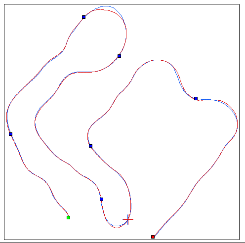
Recall that this is what the course looks like from the GPS data, with sectors designated by dots. Run 1 is in blue, Run 3, overall slightly faster, is in red.
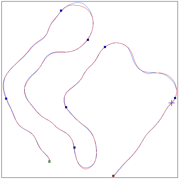
Fig. 1 Overall Course Day 1
I want to focus now on the revised seventh segment from the start (green dot), which is the one preceding the cross-hairs, i.e. the last one before the finish segment.
A closeup of segment 7 looks like this. It contains three sweeping corners.
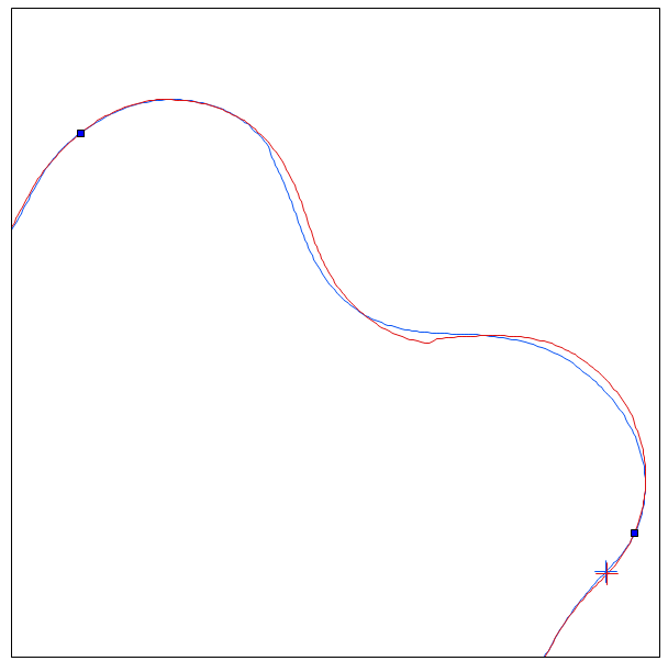
Fig. 2 Segment 7 Close-up
Right off we can see significant differences between the two tracks. There even appears to be a kink in the red path, Run 3. Uh-oh! That’s probably not good.