The showcase turn was an increasing radius on Day 1, the way most people drove it . I lost of lot of time in it on my third run. The data can tell us how much.
If you recall from Part 1 we are looking at 20Hz GPS data. I don’t have engine parameters, steering angle, brake pressure… just position, velocity and acceleration and what can be derived from those. For Part 2 I’ve slightly redefined the segments as compared to Part 1. They look like this, with the start being the lower left green dot:
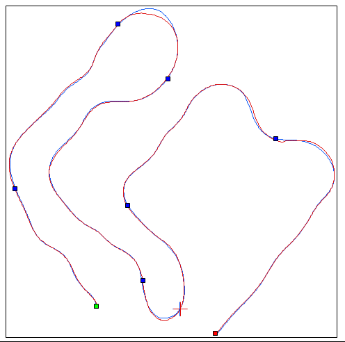
Full 1 Mile GPS Track In 7 Segments
The cross-mark is in the middle of the showcase turn, which is Segment 5. Here’s the segment time data, with Run 3 set as the baseline:

Segment Times- Part 2
The Run 1 S5 delta is -00.40, meaning 4 tenths of a second faster (less time) than in Run 3. What happened to lose so much time the third time through this corner?
I do remember what happened, and it’s evident in the video, but as an exercise let’s see what we find in the data.
First up, it is clear from this close-up of the two tracks that Run 3 in red went a little deeper and therefore longer.

Showcase Turn Closeup
How much longer? The data says no more than 3 feet. Can that account for four tenths? Well, at 36 mph three feet takes less than .06 seconds… that’s only 15% of the delta. We need to look closer. (Doing such calcs is easy if you remember from high-school physics class that 60 mph is right at 88 ft/second. So, doing the proportion, 36 mph/60mph x 88 = 52.8 ft/s and 3 ft/52.8ft/s = .057s and .06/.4 = .15 or 15%)
Here are graphs of various parameters, all synched-up to position. If you want, I’ll walk you through it.

Segment 5 Data Graphs
Speed is on top. Just before the 800 foot position the car in Run 3 (red) is going about 2 mph faster than Run 1 (blue) as I start slowing for the turn. This is at A on the next chart. Right at 800 feet the car is at a maximum of negative longitudinal acceleration of just about -1g as seen on the bottom trace and you can see the red goes a little lower than the blue. This is the maximum braking point for the corner. The traces show smooth brake application and relatively smooth coming off the brakes. (The longitudinal acceleration will read essentially zero when coasting.) So, the red run entered a little faster and braked a little harder. This indicates I’m hustling the car a little more in run 3.
By about 840 we know that I’m beginning to apply throttle again because the longitudinal accelerations, both red and blue, are turning positive.
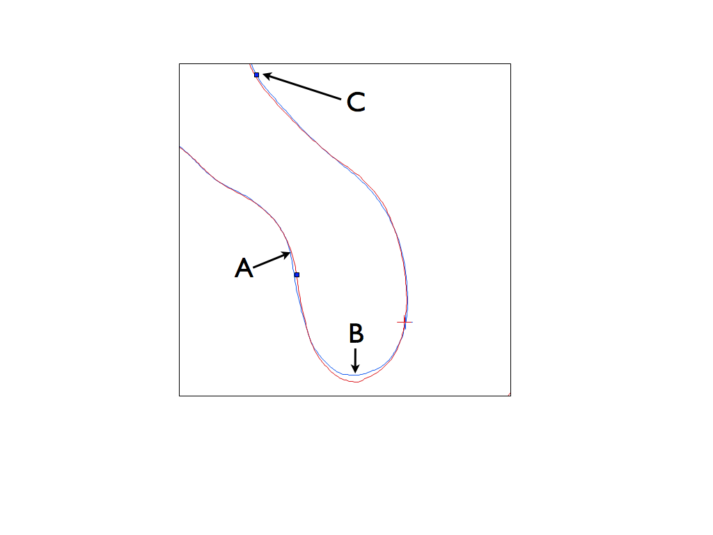
Showcase Turn Locations
Minimum speeds for both tracks are reached at point B. Red gets down to 31.5 mph, while blue is a little slower at 29.5 mph. (I can look closer at the data to see this than you can read from the chart.) So, a 2 mph difference. So far, all is essentially identical and, in fact, the delta T trace is zero at 845 feet.
I need to explain that the delta T trace is baselined by Run 3. That’s the horizontal red line. (It can’t gain or lose to itself, so it’s flat.) The blue trace shows how Run 1 either gains or loses time to the baseline over the interval being graphed. This is one of the primary tools of data comparison. The blue trace has lost some time from about 770 to 870 feet. This is probably because the red entry was faster.
Then something strange happens. The blue line starts dropping toward the baseline (saving time!) and then goes underneath it. The blue trace continues to save time until the end of the trace and the amount by then is just at our 0.4 seconds. (See the 0.394 on the left side?) Point C on the track corresponds to the right edge of the graph.
Several things are evident from the data starting at about 870 feet. Going from top to bottom on the data graphs, first we see red speed start to decrease, instead of increase like the blue. Then we see the red lateral acceleration, that’s how hard the car is turning, reach a peak before 870 and then drop. Simultaneously, the longitudinal acceleration of the red track drops below zero. This means the red car is slowing down right when the blue trace continues to accelerate as the corner opens up.
So, at 870 in Run 3 the car, which was speeding up at 860 (positive longitudinal acceleration), starts slowing down. It also stops turning as hard. Even after 880, when it picks up speed again, it can never catch up to blue and continues to lose time. Whatever happened at 860 affected the results all the way until the end of this segment.
What really happened? There might be more than one possible explanation, but what actually happened is that I got on the gas too early, the back end slewed around and the car slid sideways for a bit. It slowed because of the sliding, not because I hit the brakes.
Because I have purely GPS data, we cannot know the attitude of the car, i.e. what direction it’s pointed in. We only know what direction it’s actually traveling. If we had yaw data, say from an inertial accelerometer as some data units have, we would see a big yaw to the left.
If you want to see evidence of the big yaw to the left, you can watch the video here. The slide starts a little after 47 seconds. You can look at that video and know how much it cost to make that one mistake… 0.4 seconds.
One more thing that I find interesting: The data shows that I did almost the exact same thing on Run 1, but somehow saved it. Go back and look at the longitudinal acceleration trace at 860 feet in the Segment 5 Data Graphs chart. See that big dip of the blue line into negative territory then the immediate jump back positive? That’s what happened when I felt the loss of rear traction, got off the gas for an instant, then back on.
Why couldn’t I do that in Run 3? Beats me!

Ed, I’m really enjoying your blog!
Could you provide any detail on what software/hardware you are using to collect your data and what tools you are using for analysis?
LikeLike
I use a product called V-box Sport from the English company Racelogic. It’s a stand-alone battery-powered device that suction mounts to the inside of the windshield. The software is called Circuit Tools and is a free download to anyone. There are more expensive versions that integrate with video and other sensors.
LikeLike
For metal bodied cars, there’s a magnetic external antenna for the VBox Sport from Racelogic. I think it gets a little better reception than the internal antenna and gets the VBox off the windshield so you can put a smart phone there instead. The VBox Sport integrates well with the Harry’s Laptimer app for iOS or Android. Then you can get a Bluetooth OBDII adapter to get engine data too. The smart phone app will give you lateral and lineal acceleration directly rather than having to differentiate the GPS position vs time data twice and then filter the bejesus out of it. If the magnetometers in smart phones didn’t have so much hysteresis, you could get yaw data from that. A Dual XGPS160 will give you 10Hz GPS with HLT for less money than the VBox Sport too. The Dual picks up the Russian GLONASS satellites too.
I’m not a big fan of Circuit Tools. I’d rather put the data in a spreadsheet. But it is free. Solostorm is an option for Android, but it’s a lot more expensive than HLT.
LikeLike
Would you please put your .vbo files from Wilmington in a public Dropbox folder or email them or something. I’d like to see if I was just slow everywhere or whether there were significant individual major errors, other than not being able to shift to third on Saturday for the finish.
LikeLike
Will do.
LikeLike